Getting to know California requires trying to understand Los Angeles.
Since 2009, the Mapping Los Angeles Project has used public data to document 272 different Los Angeles neighborhoods. The Times Web site describes it as “a growing resource about the neighborhoods that make up Los Angeles County,” including maps and information about demographics, crime and schools across the L.A. region.
Having spent the last several months in search of good data, well presented, about California, I can tell you it is at a premium. The Times has accumulated a tremendously valuable, and elegant, resource that can help us gain insights into the state’s most populous region.
These maps give us a window into where we are as a state, as a people and as a society.
The maps can be used to tell many stories. The examples I pulled below show evidence of a strong overlap between age, ethnicity and wealth in California’s population center.
(Note: These illustrations you see below are static images. To check out the dynamic, scroll-over maps, click the links in the text)
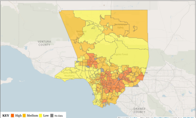
With the lone exception of Venice, the neighborhoods contained within the coastal swath from Malibu to Rancho Palos Verdes have a Latino population in the single digits or low 10s, while inland areas from Exposition Park to Pomona are all more than 50% Latino. The darker the orange in the map below, the higher the concentration of Latinos.
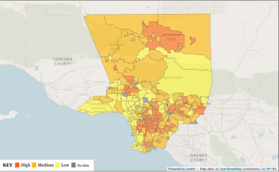
Those same coastal districts rank the lowest in number of young children, while the Latino counties mentioned above rank at or near the top. Again, the districts with the highest percentage of children are darker orange.
Those coastal enclaves also have high concentrations of median incomes higher than $125,000, while many of the same inland areas with higher concentrations of Latinos have fewer high-income earners.
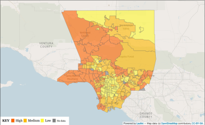
These maps tell a story. In our state’s most populous region, we are getting older, whiter and richer at the coast, and poorer, browner and younger inland.
The Los Angeles Times neighborhood mapping project is a tremendous resource for anyone trying to connect the dots with California data. You can poke around and see Los Angeles illustrated here.
If you find other interesting stories in these maps, email me …